

Company News
Randox unveils Acusera 24.7 to streamline QC data
Are you still using spreadsheets for your QC data and Charts?

You’ve been left behind.
But don’t worry!
Your laboratory’s ultimate ally in the quest for precision and excellence has arrived.
Acusera 24.7 is a tool that not only streamlines your QC data but also empowers you with a treasure trove of invaluable charts.
These charts are more than just numbers and lines; they are your secret weapon for troubleshooting, achieving accreditation, and driving continuous process improvement.
Acusera 24.7 doesn’t just offer charts. It offers a symphony of insights at your fingertips. From the precision of interactive Levey-Jennings charts to the competitive edge of performance summary charts for peer group comparison, from the rhythm of weekly mean charts to the clarity of reliable SD histograms – these charts are your compass in the world of quality control.
The best part?
You’re in control.
Tailor these charts to your unique needs, whether you’re dealing with single or multiple analytes, an abundance of QC lots, fixed or variable SDs, or need to pinpoint data within a specific date range.
Join us on a journey through the world of Acusera 24.7’s charts, where data becomes your strategic advantage, and discover why more laboratories are choosing Acusera 24.7 for QC data management every day.
Levey-Jennings Charts
Every laboratorian has seen countless Levey-Jennings charts and for good reason.
These charts are the unsung heroes of quality control in the laboratory.
They offer a visual snapshot of data over time, helping to detect trends, outliers, and systematic errors that might otherwise go unnoticed. Levey-Jennings charts are like the heartbeat monitor of your laboratory, providing real-time insights into the health of your analytical processes.
We’ve taken Levey-Jennings charts to the next level.
Our colourful graphs might look like they belong in a modern art museum, but trust me, they’re more than just eye candy.
Acusera 24.7’s Levey-Jennings charts are like the laboratory’s personal detective, sniffing out anomalies and shifts and making sure your QC data behaves.
Let’s have a look at what you can do with the Acusera 24.7 interactive Levey-Jennings charts.
The screenshot below shows a Levey-Jennings chart for a single analyte, with the date on the X-axis and SD on the Y-axis. On this chart, you can see data points displayed in different colours. Green data points indicate an acceptable result. Orange points show data that has triggered your predefined alert criteria, while red points are those that have broken your set rejection rules.
The lines marked on the chart below represent events that have been recorded. Instrument events such as calibration events or maintenance can be recorded to monitor their effects on your QC, allowing you to quickly see how these events relate to any deviations or improvements in your QC data. For example, after the event labelled ‘Reagent lot change’ you can see a series of alerts and failures. Marking this event on the chart allows for an at-a-glance explanation of this deviation. These events are completely customisable so you can record any relevant information you want!
Finally, data points that appear as a triangle indicate a comment has been added. What text is included in the comment is completely up to you!

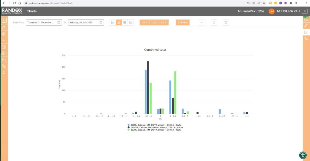
The next screenshot below shows a Levey-Jennings chart containing QC data for all the tests included in the Clinical Chemistry Panel.
Acusera 24.7 panels allow you to group related tests together, helping increase the efficiency of your data review.

It looks great, right?
Maybe a little confusing.
The screenshot is perhaps a little deceptive.
When viewing these charts live, you can view the data as a whole, or home in on individual data sets by simply hovering over the data you want to see. You can also selected a deselect datasets at will by clicking on its name in the list below the chart.
The screenshot below shows an example of this.

All the charts we’ve looked at so far have had a fixed 3SD on the Y-axis.
For a more in-depth review of your data, you may wish to expand this axis.
With the click of a button, you can expand the Y-axis to include all your data points. See below for an example.

In some cases, you may wish to view this data displayed as ‘% Deviation’.
Again, with the click of a single button, you can convert the Y-axis to show just that, as shown below.

Performance Summary Charts
Peer group comparison of IQC data has a lot of benefits.
Comparing your data with other laboratories that use the same QC lot, instrument, method and more, can help you with troubleshooting and continuous process improvement.
The Acusera 24.7 Performance Summary Charts do all the work for you.
As shown in the screenshot below, these charts display your data and how it compares to your peers including mean, CV, and SD.
You can also view this data in a table to get a more detailed picture of your performance.

Like the Levey-Jennings charts, you can also combine this information for panels or a selection of multiple lots and analytes. You can see an example below:

Weekly Mean Charts
Weekly Mean Charts are one of the new features in our latest software release.
They allow you to view your weekly count of QC results for a specific instrument, assay, or lot.
Below is an example in a bar chart format.

You can also view this data as a line graph, which plots the weekly mean of results from multiple instruments using the same assay and QC lot, allowing a comprehensive overview of your QC data.

Or you can view your weekly means for a range of tests and panels.

Finally, the SD Histograms allow you to view the distribution of your results, for an overview of performance.
When used with Acusera 24.7’s suite of advanced statistical tools and reports, our charts can help you reduce the time you spend investigating non-conformances.
When the dreaded accreditation assessment approaches, you can relax. While others are scrambling to find documentation, you can rest assured that all the QC data you need is easily accessible.
Assessors love to see Acusera 24.7 load when they enter a laboratory because they understand how much easier QC management is when using our software.
We provide complete onboarding assistance and full training on the software for new customers while delivering prompt and effective customer support for existing users. The Acusera 24.7 and QC operations teams are always eager to help new and existing Acusera 24.7 users with any issues they experience.
MB Bureau